We’re working on a new page layout for our ebooks
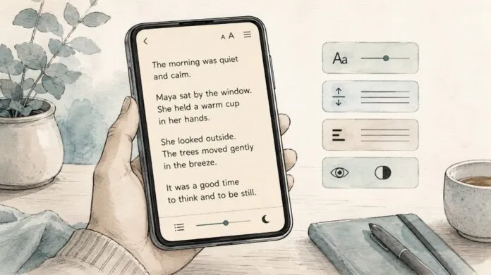
The purpose of this feature is simple: to make ebook pages easier and more comfortable to read for some people with dyslexia, visual stress, or related reading difficulties.
Many reading apps let users adjust visual settings manually. We want to make it easier by offering a research-informed starting theme, while preserving full manual control.
Our apps already allow readers to manually adjust the appearance of book pages. You can change settings such as font style, font size, line spacing, margins, alignment, colour theme, and other display preferences. But we know that not every reader wants to experiment with a long list of settings before they can settle into a book.
The idea is to give you a thoughtful, research-informed starting point: one tap to apply a set of reading-friendly choices, with the freedom to tweak anything afterwards.
We would welcome comments, corrections and practical advice from dyslexia organisations, accessibility specialists, educators, researchers, and readers with lived experience.
Why we think this matters
Reading comfort is highly personal. What works beautifully for one reader may not work for another. That is especially true for dyslexic readers, who may experience visual crowding, difficulty tracking lines, sensitivity to spacing, or fatigue when reading dense blocks of text.
A common example is full justification. Fully justified text looks so neat and book-like, but it often creates uneven gaps between words. On a small phone screen, those gaps can become especially noticeable. Some readers find that this makes text harder to follow. Left-aligned text, with a ragged right edge, is often easier because the spacing between words remains more consistent.
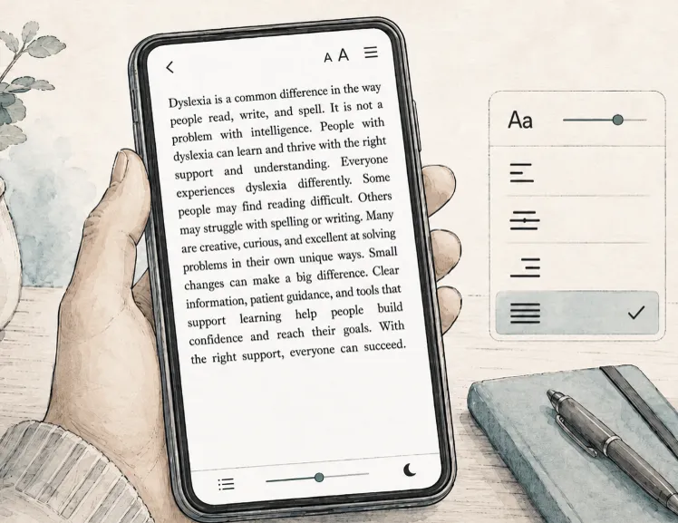
That is the kind of problem this new mode is designed to address.
There isn’t one perfect layout for all dyslexic readers. Nor can typography “solve” dyslexia. But good reading controls can reduce unnecessary friction and make digital reading more comfortable.
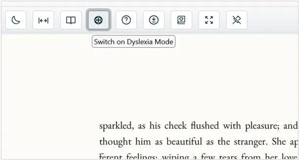
Test our dyslexia mode here:
https://reader.ebooks.com/moonstone
When the book opens, click on the button in the top menu:
What the mode would change
Our current plan is for Dyslexia Mode to apply the following settings by default:
1. Left-aligned text
Paragraph text would be set to left aligned, rather than fully justified.
This avoids uneven word spacing and reduces the chance of “rivers” of white space appearing through the page. We believe this is one of the most important choices for a dyslexia-friendly reading mode, especially on narrow mobile screens.
2. Clear sans-serif font
Dyslexia mode uses a clear, familiar sans-serif font by default. Sans-serif fonts have simple letter shapes and are widely used for screen reading. While some readers prefer specialist dyslexia fonts, the research does not show that any one font is best for everyone. We have therefore chosen a common, readable font as a practical starting point, while leaving you free to select a different font if another style works better for you.
3. Slightly larger text
The theme would increase the default text size slightly.
Larger text can reduce visual strain and make word recognition easier for many readers. We do not want to make the type so large that each line becomes too short, particularly on phones, but we do think the theme should start a little larger than the standard reading view.
You’ll still be able to increase or decrease the size after applying the theme.
4. More generous line spacing
The theme would have more space between lines of text than a conventional ebook layout.
Our current thinking is to use line spacing of around 1.4 to 1.5. This should give the text more breathing room without making lines feel disconnected from each other.
Some readers may prefer more spacing, and others may prefer less. The theme would simply provide a comfortable starting point.
5. Comfortable margins
The theme would use moderately generous margins.
Margins can reduce the sense of visual crowding, but on a phone there is a trade-off: margins that are too wide can make each line too short. We will aim for a balanced setting that gives the page some breathing room while preserving a useful line length.
6. A softer background
The theme would use dark text on a warm off-white or cream background, rather than stark black text on a pure white background.
Some readers find high-glare white backgrounds uncomfortable. A softer background may reduce visual stress while still maintaining good contrast.
We will continue to offer other colour themes, including high-contrast options, because colour preferences vary considerably.
7. Conservative hyphenation
The theme would either turn hyphenation off or use it conservatively.
Breaking words across lines can add an extra decoding burden for some readers. Avoiding unnecessary hyphenation may make reading flow more naturally, especially for younger readers or those reading in a second language.
Options not included by default
Character spacing
“Character spacing” controls the amount of space between individual letters. Increasing letter spacing can help some dyslexic readers by reducing visual crowding. However, other readers find that extra letter spacing makes words feel fragmented and harder to recognise.
For this reason, our dyslexia mode does not increase letter spacing by default. The evidence suggests that this setting is highly individual, so we have left it for you to adjust according to your own needs.
You can still increase letter spacing manually in the reading settings.
OpenDyslexic font
OpenDyslexic is a specially designed font from Google that is intended to make letters easier to distinguish for some readers with dyslexia. Some people find it helpful or more comfortable to read.
Others do not.
For this reason, dyslexia mode does not switch the book to OpenDyslexic by default. The research on specialist dyslexia fonts is mixed, and there does not appear to be strong evidence that any one font is best for all dyslexic readers.
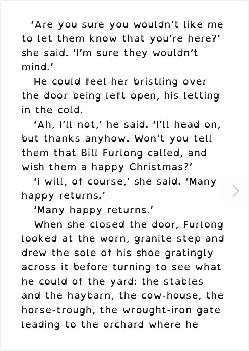
Instead, the mode uses a clear, familiar sans-serif font as its default. If you prefer OpenDyslexic you can easily select it in the font settings. Here’s an example of OpenDyslexic font:
What the theme would not do
The theme would not lock users into a fixed design.
After applying dyslexia mode, you can then adjust the settings manually to suit your preferences. You might change the font, enlarge or reduce the text, alter line spacing, switch colour themes, adjust margins, or change alignment.
The theme would also not override every aspect of publisher design. Layout really matters for poetry. And some books contain tables, diagrams, code samples, or other material where layout carries meaning. We need to preserve the integrity of the book while still giving readers better control over ordinary reflowable paragraph text.
Why we are asking for comment
We want this feature to be useful, respectful and evidence-informed. We’re especially interested in feedback on questions such as:
- Are these the right default settings for a dyslexia-friendly reading theme?
- Would you recommend different defaults for font, spacing, background colour, or margins?
- Are there settings we should leave alone?
- Should “Open Dyslexic” be the default font?
- Are there particular problems dyslexic readers encounter in ebook apps that we may not have considered?
- How should we explain this feature to users in a way that is helpful?
- Would “Dyslexia Mode” be the right name, or would another label be clearer and more inclusive?
Our aim
Our aim is not to create a perfect dyslexia layout, but just to reduce friction.
You should not need to understand typography, accessibility standards, or ebook rendering settings just to make a page feel readable. We want to make it so you can open a book, choose a helpful theme, and then adjust it further if you wish.
If you have expertise or lived experience in this area, we would be grateful for your advice. We are listening, and we would like to get this right. Please just drop any thoughts or suggestions in the comments field below.
