One of the pleasures of being in the book industry for so long (hmm… it’s been 36 years. When did that happen?) Anyway, one of the real pleasures is staying in touch with colleagues: booksellers, publishers, distributors, writers and innovators.
Sometimes we hear about a development or just get a snippet of news that might be interesting to others. We hope you enjoy our occasional posts about books and reading.
Here’s how to try the new eBooks.com apps, without spending anything.
We’ve put together a small collection of free classics. The books will be added to your eBooks.com library and delivered using the same secure Readium LCP system that we use for protected commercial ebooks.
Click Add all to my library. (You’ll probably need to sign in or create a free account.)
Your books will appear in your library.
Select a book and follow the steps.
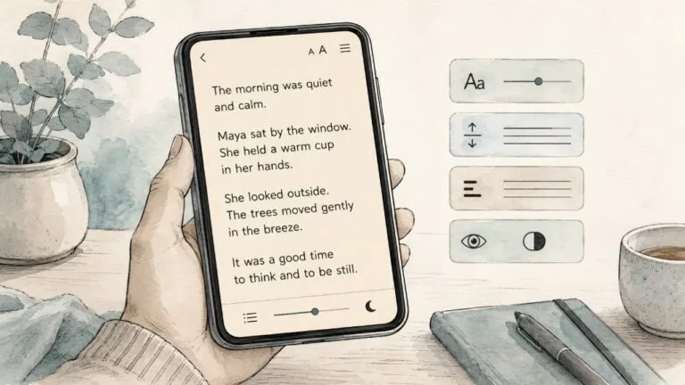
You can then explore the new reading experience for yourself: change the typeface and text size, adjust spacing and layout, try dark mode and accessibility features, move between chapters, and download books for offline reading.
One groovy thing is that, if you highlight text in a book on your phone and the same book is already open on your desktop (in the online reader), the highlights and notes will magically appear in real time on your desktop. The ghost in the machine.
Because these books use the same delivery process as our commercial ebooks, this is a useful way to see how the new eBooks.com platform works from a reader’s point of view.
Pick a classic and take the new eBooks.com readers for a spin.
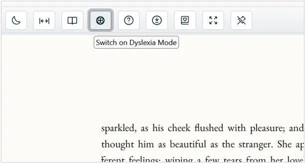
The purpose of this feature is simple: to make ebook pages easier and more comfortable to read for some people with dyslexia, visual stress, or related reading difficulties.
Many reading apps let users adjust visual settings manually. We want to make it easier by offering a research-informed starting theme, while preserving full manual control.
Our apps already allow readers to manually adjust the appearance of book pages. You can change settings such as font style, font size, line spacing, margins, alignment, colour theme, and other display preferences. But we know that not every reader wants to experiment with a long list of settings before they can settle into a book.
The idea is to give you a thoughtful, research-informed starting point: one tap to apply a set of reading-friendly choices, with the freedom to tweak anything afterwards.
We would welcome comments, corrections and practical advice from dyslexia organisations, accessibility specialists, educators, researchers, and readers with lived experience.
Reading comfort is highly personal. What works beautifully for one reader may not work for another. That is especially true for dyslexic readers, who may experience visual crowding, difficulty tracking lines, sensitivity to spacing, or fatigue when reading dense blocks of text.
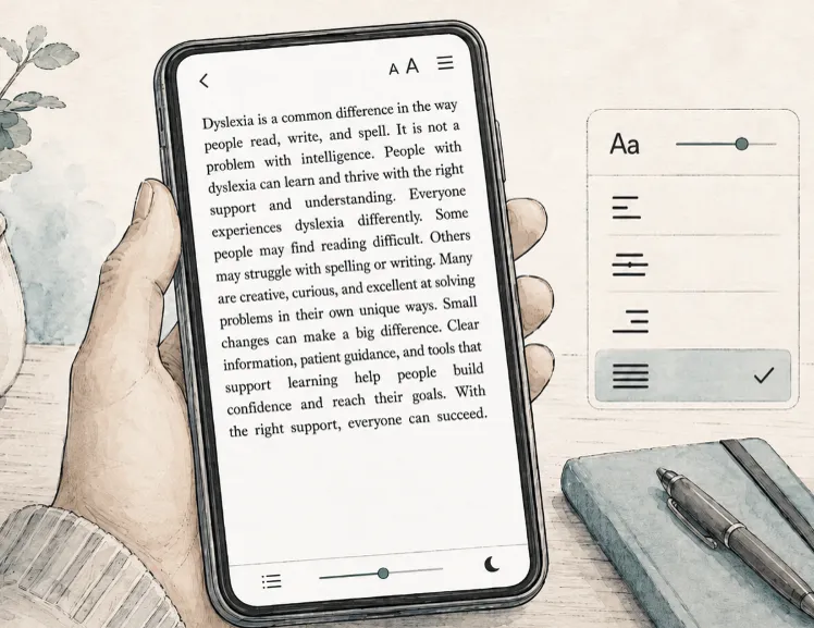
A common example is full justification. Fully justified text looks so neat and book-like, but it often creates uneven gaps between words. On a small phone screen, those gaps can become especially noticeable. Some readers find that this makes text harder to follow. Left-aligned text, with a ragged right edge, is often easier because the spacing between words remains more consistent.
When a page of text is fully justified, it looks visually appealing – a nice, neat rectangle of text – but it can be challenging or tiring for some readers.
That is the kind of problem this new mode is designed to address.
There isn’t one perfect layout for all dyslexic readers. Nor can typography “solve” dyslexia. But good reading controls can reduce unnecessary friction and make digital reading more comfortable.
Paragraph text would be set to left aligned, rather than fully justified.
This avoids uneven word spacing and reduces the chance of “rivers” of white space appearing through the page. We believe this is one of the most important choices for a dyslexia-friendly reading mode, especially on narrow mobile screens.
2. Clear sans-serif font
Dyslexia mode uses a clear, familiar sans-serif font by default. Sans-serif fonts have simple letter shapes and are widely used for screen reading. While some readers prefer specialist dyslexia fonts, the research does not show that any one font is best for everyone. We have therefore chosen a common, readable font as a practical starting point, while leaving you free to select a different font if another style works better for you.
The theme would increase the default text size slightly.
Larger text can reduce visual strain and make word recognition easier for many readers. We do not want to make the type so large that each line becomes too short, particularly on phones, but we do think the theme should start a little larger than the standard reading view.
You’ll still be able to increase or decrease the size after applying the theme.
The theme would have more space between lines of text than a conventional ebook layout.
Our current thinking is to use line spacing of around 1.4 to 1.5. This should give the text more breathing room without making lines feel disconnected from each other.
Some readers may prefer more spacing, and others may prefer less. The theme would simply provide a comfortable starting point.
Margins can reduce the sense of visual crowding, but on a phone there is a trade-off: margins that are too wide can make each line too short. We will aim for a balanced setting that gives the page some breathing room while preserving a useful line length.
The theme would either turn hyphenation off or use it conservatively.
Breaking words across lines can add an extra decoding burden for some readers. Avoiding unnecessary hyphenation may make reading flow more naturally, especially for younger readers or those reading in a second language.
Options not included by default
Character spacing
“Character spacing” controls the amount of space between individual letters. Increasing letter spacing can help some dyslexic readers by reducing visual crowding. However, other readers find that extra letter spacing makes words feel fragmented and harder to recognise.
For this reason, our dyslexia mode does not increase letter spacing by default. The evidence suggests that this setting is highly individual, so we have left it for you to adjust according to your own needs.
You can still increase letter spacing manually in the reading settings.
OpenDyslexic font
OpenDyslexic is a specially designed font from Google that is intended to make letters easier to distinguish for some readers with dyslexia. Some people find it helpful or more comfortable to read.
Others do not.
For this reason, dyslexia mode does not switch the book to OpenDyslexic by default. The research on specialist dyslexia fonts is mixed, and there does not appear to be strong evidence that any one font is best for all dyslexic readers.
Instead, the mode uses a clear, familiar sans-serif font as its default. If you prefer OpenDyslexic you can easily select it in the font settings. Here’s an example of OpenDyslexic font:
The theme would not lock users into a fixed design.
After applying dyslexia mode, you can then adjust the settings manually to suit your preferences. You might change the font, enlarge or reduce the text, alter line spacing, switch colour themes, adjust margins, or change alignment.
The theme would also not override every aspect of publisher design. Layout really matters for poetry. And some books contain tables, diagrams, code samples, or other material where layout carries meaning. We need to preserve the integrity of the book while still giving readers better control over ordinary reflowable paragraph text.
Our aim is not to create a perfect dyslexia layout, but just to reduce friction.
You should not need to understand typography, accessibility standards, or ebook rendering settings just to make a page feel readable. We want to make it so you can open a book, choose a helpful theme, and then adjust it further if you wish.
If you have expertise or lived experience in this area, we would be grateful for your advice. We are listening, and we would like to get this right. Please just drop any thoughts or suggestions in the comments field below.
Launched in 2000, eBooks.com is the oldest e-bookstore on the web, selling ebooks published by local and global book publishers to a world-wide audience.
eBooks.com operates as a recommendation service and e-bookstore.
Sign up for our email alerts and you’ll receive regular reading recommendations in your fields of interest. Our recommendations are not AI-driven; they are personal recommendations from our team of real, human editors.
As an e-bookstore, we operate much like Amazon or any other online retailer, except that we only sell books in digital form. You can search or browse millions of ebooks. When you find something you’d like to read, buy it and you can be reading in a matter of minutes.
You can download our ebooks to any of thousands of ebook reader devices, as well as your smart phone, tablet or computer. Here’s how:
Download your ebook: Log in to eBooks.com, go to your bookshelf, and click Download next to your chosen ebook. Download the lcpl file and open it in Thorium Reader.
Enter your Reading Key: When Thorium Reader asks for an LCP Passphrase or Reading Key, copy the key from the eBooks.com download page and paste it into the app.
Note: You only need to perform Steps 1&3 the first time you download an ebook. For future ebooks, you can simply click Download.
If you have an e-reader device that is compatible with Readium LCP (lcpl files), you can then transfer the ebooks to your e-reader from your computer. (More about transferring ebooks via Thorium Reader)
Install the eBooks.com app: Install our eBooks.com app on your device (Click here for an eBooks.com app user guide). There are three versions available. Depending on the type of device you have, install one of these:
Sign in to the app: With the app open, login using the same credentials you used for your eBooks.com account.
Download your ebook: Tap on the cover of the ebook you’d like to read.
Note: You only need to perform Steps 1&2 the first time you download an ebook. For future ebooks, you can simply open the app and tap the cover to download. For more information please see our app download guide.
E-Ink device: How to transfer an ebook from a computer to an Adobe compatible e-reader
You’ll need to have an app called Adobe Digital Editions (“ADE”) installed on your computer and device. Most of the ebooks we sell are locked (encrypted) by their publishers, and this ADE software unlocks ebooks.
It’s likely that ADE is already installed on your device, but that’s not true of all devices, so you should check here to make sure your device is compatible.
There are three ways to read ebooks from eBooks.com on your computer.
The easiest option is to read online in your browser using our Online Reader. You do not need to install anything.
If you prefer to download your ebooks and read them offline, we recommend using Thorium Reader, a free desktop reading app designed for modern ebooks.
We also continue to support Adobe Digital Editions, for customers who already use it or prefer to keep using it.
Think of it like music: you can either stream a song, or you can download it and play it in an app. Reading online is like streaming. Downloading gives you a copy of the ebook file on your computer.
Recommended option: Read online with our Online Reader
The simplest way to read your ebook is to use our Online Reader.
Click the Read now button next to the title of the book.
Your ebook will open inside your web browser. You do not need to download any software or install a reading app.
Our Online Reader works in all major modern browsers and includes helpful reading features such as adjustable text size, layout settings, and accessibility-friendly controls.
For most customers, this is the quickest and easiest way to start reading.
Recommended download option: Use Thorium Reader
If you would like to download your ebook and read it offline on your computer, we recommend Thorium Reader.
Thorium Reader is a free desktop reading app for Windows, Mac and Linux. It is designed for EPUB ebooks and provides a clean, modern reading experience.
Once the book has been added to Thorium Reader, you can read it there without returning to eBooks.com each time.
Thorium Reader is the best choice if you want to keep your ebooks available on your computer and read them offline.
Still supported: Adobe Digital Editions
We continue to support Adobe Digital Editions, also known as ADE.
If you already use ADE and are happy with it, you can keep using it. However, for most customers who are setting up desktop reading for the first time, we recommend using our Online Reader or Thorium Reader instead.
To use Adobe Digital Editions:
1. Install Adobe Digital Editions
Install Adobe Digital Editions on your computer.
If you need help, please see our guide: Installing Adobe Digital Editions on your computer.
2. Authorize Adobe Digital Editions
After installing ADE, you need to authorize it. This allows your downloaded ebooks to unlock correctly.
To authorize ADE:
Open Adobe Digital Editions on your computer.
If a book is open, click Library to return to Library view.
Click Help.
Click Authorize Computer…
In the eBook Vendor field, select Adobe ID.
Enter your ByteBooks username and password.
Click Authorize.
If you do not already have a ByteBooks account, click here and follow the instructions on ByteBooks’ website. Then return to ADE and enter your username and password.
Please keep a note of your ByteBooks username and password. You may need them later if you change computers or need to authorize a new device.
3. Download your ebook
Return to your eBooks.com account and click Download next to the book title.
Once ADE has been installed and authorized, you usually only need to do this setup once. Each time you buy a new ebook from eBooks.com, you can click Download and open the book in Adobe Digital Editions.
Which method should I choose?
For the quickest and easiest experience, choose Online Reader.
If you want to download your ebook and read offline, choose Thorium Reader.
If you already use Adobe Digital Editions and want to continue with it, you can do so.
If you need help at any stage, please contact us and we will be happy to assist.
If you are reading on a computer, we recommend Thorium Reader.
If you rely on Adobe Digital Editions to transfer books to an e-ink device, you should continue using Adobe Digital Editions until your device supports a newer method.
We will continue supporting Adobe Digital Editions for as long as it’s needed
We recently asked a large group of eBooks.com customers how they felt about moving from Adobe Digital Editions to Thorium Reader.
The response was enthusiastic. Most people were happy to make the switch. Thorium Reader is modern, stable, accessible, and easier to use. It works on Windows, Mac and Linux, and it supports the newer Readium LCP content protection system, which we believe is a much better long-term solution for our customers.
But there is one important exception.
If you use an older e-ink reading device, such as some Kobo, Sony, PocketBook, Nook or other dedicated e-reader tablets, and you normally transfer ebooks from your computer to that device using Adobe Digital Editions, then you should continue using Adobe Digital Editions for now.
Why Thorium Reader is usually the better choice
For most customers who want to read ebooks on a computer, Thorium Reader is the option we recommend.
Thorium is a free desktop reading app developed by EDRLab, the organisation behind Readium LCP. It is designed for modern EPUB reading and includes many features that make reading easier and more comfortable, including:
a clean, modern reading interface
strong support for EPUB 3
excellent accessibility features
support for Windows, Mac and Linux
adjustable text size, spacing and display settings
support for Readium LCP-protected ebooks
ongoing development and improvement
In short, Thorium Reader is a much more modern ebook platform than Adobe Digital Editions.
If you read your eBooks.com books on your computer, Thorium is likely to be the better choice.
When Adobe Digital Editions may still be the right choice
There is one situation where Adobe Digital Editions may still be necessary.
Some customers do not read mainly on their computer. Instead, they download ebooks to their computer and then transfer it to a separate tablet device.
For many years, Adobe Digital Editions has been the standard way to do this. Some e-ink devices rely on Adobe’s system in order to transfer it from the computer to the device.
So, if your normal reading routine is:
buy or download the ebook from eBooks.com
open it on your computer in Adobe Digital Editions
connect your e-ink device with a USB cable
transfer the ebook from Adobe Digital Editions to the device
… then you should continue choosing Adobe Digital Editions for the time being.
That does not mean ADE is better than Thorium. It simply means your particular device may still depend on Adobe’s older transfer system.
A simple rule of thumb
Choose Thorium Reader if you want to read your ebook on:
your Windows computer
your Mac
your Linux computer
a modern reading app that supports Readium LCP
Choose Adobe Digital Editions if you need to transfer your ebook to an older e-ink device that still requires ADE.
What about Kobo, Sony and other e-ink devices?
Many dedicated e-ink devices were built around the Adobe Digital Editions system. This is especially true of older models.
If your device instructions tell you to use Adobe Digital Editions, or if you have successfully transferred eBooks.com purchases to that device using ADE in the past, then the safest approach is to keep using ADE for that device.
This may include some devices made by Kobo, Sony, PocketBook, Nook and others. Compatibility varies by model, so the important question is not just the brand of the device, but how that particular device handles protected EPUB files.
Will this change in the future?
Yes, we expect this to change over time as device makers modernise their requirements.
The ebook industry is moving toward newer, more open and more reader-friendly systems. Thorium Reader uses Readium LCP, a modern content protection technology designed specifically for ebooks. LCP is already used by libraries, universities, booksellers and reading platforms around the world.
We expect more device manufacturers and reading systems to support LCP over time. As that happens, more readers will be able to use Thorium Reader and LCP-based downloads as their normal route to reading on different devices.
But we are not quite there yet.
For customers with older e-ink devices that still require Adobe Digital Editions, ADE remains necessary for now.
Our recommendation
If you are reading on a computer, we recommend Thorium Reader.
It is modern, accessible, easy to use, and better aligned with the future of ebook reading.
But if you rely on Adobe Digital Editions to transfer books to an e-ink device, you should continue using Adobe Digital Editions until your device supports a newer method.
We know this can be confusing. The important thing to remember is that you do not need to switch just for the sake of switching. Choose the option that works best for the way you actually read.
For many customers, that will now be Thorium Reader.
For some customers with older e-ink devices, it will still be Adobe Digital Editions.
We’re pleased to announce that eBooks.com now supports Thorium Reader, a free desktop reading app for Windows, Mac and Linux.
This is an important step in our move toward a simpler, more modern ebook experience. For many years, customers who wanted to download protected ebooks to a computer had to use Adobe Digital Editions. That option is still available where needed, but Thorium Reader gives eBooks.com’s customers another, better path: one that is modern, accessible, and much easier to use.
What is Thorium Reader?
Thorium Reader is a free ebook reading application developed by EDRLab, the European Digital Reading Lab. It is designed for reading ebooks on a desktop or laptop computer, and it supports EPUB, PDF and other digital reading formats.
It is also built with accessibility in mind. Thorium Reader includes adjustable reading settings, keyboard navigation, screen reader support, read-aloud features, bookmarks, search, navigation through the table of contents, and other tools that make reading more comfortable for a wide range of users.
In short: it is a serious ebook reader for people who read seriously.
Why we are supporting Thorium
At eBooks.com, we are working to improve every part of the reading experience: our online reader, our mobile apps, and the way customers download books to read offline.
Supporting Thorium Reader is part of that larger project.
Thorium is based on open reading standards and supports Readium LCP, a newer content protection system that is designed to be much less intrusive for readers than older DRM systems. With Thorium and LCP, customers do not need to create a separate Adobe account simply to open a book they have already purchased.
That matters. Buying an ebook should not feel like solving a technical puzzle. Our goal is to make the process as straightforward as possible: buy your book, download it, open it, and read.
Better for accessibility
Accessibility is one of the strongest reasons to support Thorium Reader.
Many people need more than a fixed page on a screen. They may need larger type, different fonts, better spacing, keyboard controls, screen reader compatibility, read-aloud support, or a cleaner navigation structure. Thorium Reader has been developed with these needs in mind.
Thorium is accessible for visually impaired and dyslexic people. It is fully usable with keyboard alone and supports navigation and reading with popular screen readers like JAWS, NVDA, Narrator and Voiceover. Other accessibility features include support for high-contrast, customizable font including dyslexia font), color themes, text size and Text To Speech (TTS) read aloud.
This aligns closely with our own direction at eBooks.com. We want our reading platform to work well for as many people as possible, including readers who are blind, have low vision, have dyslexia, have mobility impairments, or simply prefer to adjust the reading environment to suit their needs.
No single reading app is perfect for every person, but Thorium is a substantial improvement over many older desktop reading options.
What this means for eBooks.com’s customers
When you download an ebook from eBooks.com to your computer, you can now open it in Thorium Reader.
For many customers, this will be the easiest and best desktop option. Thorium is free, regularly maintained, and available for Windows, Mac and Linux.
If you’re new to Thorium Reader, the basic steps are simple:
Install Thorium Reader on your computer.
Go to your eBooks.com account and download your ebook.
Open the downloaded file in Thorium Reader.
Start reading.
We have also prepared help articles to guide customers through the process.
What about Adobe Digital Editions?
We know that some customers still rely on Adobe Digital Editions, especially those who use older e-ink devices that require Adobe software to transfer ebooks from a computer to the device.
For that reason, we are not removing Adobe Digital Editions as an option. If your reading device still depends on Adobe Digital Editions, you can continue using it where it is supported.
But for customers who read on a desktop or laptop computer, who want a modern, accessible reading experience, we recommend Thorium Reader.
A step toward a more open ebook future
The ebook world has been too fragmented. Different stores, different reading apps, different accounts, different restrictions. All of this creates friction for readers.
Thorium Reader and Readium LCP point towards a better model: one based on open standards, accessibility, interoperability and convenience.
We are pleased to support that direction.
This is one more step in our broader work to modernise the eBooks.com reading experience across web, desktop and mobile. We want our customers to have more choice, less friction, and better tools for reading the books they buy.
We hope you enjoy using Thorium Reader with eBooks.com.
One of the nice things about buying ebooks from eBooks.com is that you have choices.
You can read online in your web browser, read on your phone or tablet using the eBooks.com app, or download your ebooks to a desktop reading app such as Thorium Reader. You do not need to be technically minded, and you do not need expensive software. The reading options we recommend are free.
We have recently made some major improvements to the way eBooks.com titles can be read. Our mobile apps have been rebuilt, our Online Reader has been completely upgraded, and we now support Thorium Reader for desktop users — including people who use Linux.
Here is a quick guide to the main options.
1. Read online in your web browser
The simplest way to read many eBooks.com titles is to use our Online Reader.
There is no app to install. You just sign in to your eBooks.com account, go to your bookshelf, and open the book in your browser.
Our new Online Reader is a major improvement on the previous version. It is cleaner, faster and easier to use, and it has been designed to make reading comfortable on a wide range of screen sizes.
It is a good choice if you want to start reading straight away, or if you are using a computer where you do not want to install additional software.
Best for: quick access, reading in a browser, switching between computers.
2. Read on your phone or tablet with the eBooks.com app
For reading on a mobile device, we recommend our new eBooks.com app.
These apps have replaced our older Ebook Reader apps. The new apps are built on modern technology and are designed to be simple, stable and pleasant to use.
Once you sign in, your eBooks.com library is available in the app. You can read on the move, adjust the reading layout to suit your preferences, and continue reading across devices.
The app is available for both:
iPhone and iPad
Android phones and tablets
Best for: reading on the go, phones, tablets, and everyday personal reading.
3. Read on your desktop with Thorium Reader
If you prefer to download your ebooks and read them on a desktop or laptop computer, we recommend Thorium Reader.
Thorium is a free ebook reading application for desktop computers. It works with modern ebook standards and provides a clean, accessible reading experience.
A major benefit is that Thorium supports Windows, macOS and Linux. This is especially helpful for Linux users, who were not supported by Adobe Digital Editions.
Thorium is also a good option for readers who want to keep their ebooks organised in a desktop library and read without using a web browser.
Best for: desktop reading, offline reading, Linux users, and readers who prefer a dedicated reading app.
What about Adobe Digital Editions?
For many years, Adobe Digital Editions was the standard desktop app for reading downloaded ebooks protected by Adobe DRM. Some customers may still use it.
However, eBooks.com now supports newer and more flexible reading options. For most desktop users, we recommend trying Thorium Reader instead.
Accessibility
Accessibility is a central part of our new reading experience.
Our new Online Reader, mobile apps and Thorium-compatible desktop reading options have been developed with global accessibility standards in mind. This means we are working to support readers who use screen readers, keyboard navigation, text resizing, high-contrast settings and other assistive technologies.
We want ebooks to be easier to read for everyone — not just for people using the most common devices or default settings.
Which option should I choose?
Here is the simplest answer:
If you want to start reading immediately, use the Online Reader.
If you want to read on your phone or tablet, install the eBooks.com app.
If you want to read on a desktop or laptop, especially if you use Linux, try Thorium Reader.
You can choose the option that suits you best. Many readers use more than one.
Need help?
If you are not sure which option is right for you, sign in to your eBooks.com account and go to your bookshelf. From there, we will show the reading options available for each title.
You can also contact our support team if you need help getting started.
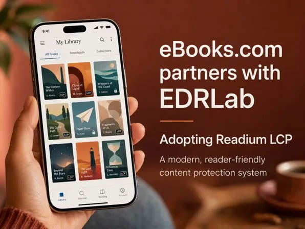
eBooks.com is partnering with EDRLab to use Readium LCP, a modern content-protection system for ebooks.
LCP helps protect publishers’ and authors’ rights while offering readers a simpler, less frustrating experience.
Unlike older DRM systems, LCP is designed for an open, interoperable ebook ecosystem rather than locking readers into one proprietary platform.
The move supports eBooks.com’s broader investment in better reading technology, including our new online reader, mobile apps and Thorium Reader support.
We’re pleased to announce that eBooks.com has partnered with EDRLab to adopt Readium LCP, a modern, elegant and interoperable content-protection system for ebooks.
For many years, ebook retailers, publishers, libraries and readers have had to work within a digital rights management landscape that has often felt unnecessarily complicated. Traditional DRM systems have helped publishers protect their content, but they have also introduced friction for readers: extra accounts, confusing authorisation processes, software limitations, and too many moments where the technology gets in the way of simply opening a book and reading.
The industry can do better.
Readium LCP — Licensed Content Protection — is a 21st century approach to protecting digital books. It has been developed for the modern ebook ecosystem: one in which readers expect to move easily between devices, publishers need dependable protection for their intellectual property, and reading systems must support accessibility, usability and long-term interoperability.
By working with EDRLab, eBooks.com is joining a community of like-minded ebook vendors, technology providers, publishers and reading-platform developers who believe that content protection should be secure, practical and reader-friendly.
Why this matters
LCP is designed to protect digital publications without locking readers into a single proprietary ecosystem. That is important.
A healthy ebook market depends on openness and interoperability. Readers should be able to buy books from trusted retailers and read them using high-quality reading software. Publishers should be able to protect their works without forcing customers through outdated or confusing technical processes. Retailers should be able to innovate, improve accessibility and deliver better reading experiences without being constrained by legacy systems.
LCP helps make that possible. It supports modern ebook formats, including EPUB and PDF, and is designed to work across a distributed ecosystem of vendors and reading applications.
For readers, this means a smoother path from purchase to reading.
For publishers, it means robust protection that is aligned with current standards and modern reading technology.
For the wider industry, it means a practical alternative to older models of ebook DRM.
A better experience for readers
Our first priority is always the reader.
Customers who buy ebooks from eBooks.com should be able to access their books with as little friction as possible. They should not need to understand the history of ebook DRM, or know which vendor owns which authorisation system, or create unnecessary third-party accounts just to read a book they have bought.
LCP gives us a path toward a cleaner and more intuitive experience.
It also fits naturally with our broader investment in new reading platforms. eBooks.com has recently been modernising the way customers read: through our new online reader, our new mobile apps, and our support for Thorium Reader on desktop.The adoption of LCP is part of the same programme of work: making ebook reading simpler, more reliable, more accessible and more pleasant.
A responsible approach to publisher protection
We understand why publishers require content protection.
Authors and publishers invest heavily in creating, editing, producing and distributing books. They need confidence that their titles can be sold digitally in a way that discourages unauthorised sharing and protects commercial value.
LCP allows us to meet that need while also improving the customer experience. It is not a rejection of content protection. It is a better implementation of it.
For publishers, this means eBooks.com can continue to support secure digital distribution while moving toward a more modern, standards-based ecosystem. For customers, it means fewer barriers and a clearer, more reliable reading experience.
Supporting accessibility and modern reading standards
Accessibility is central to the future of digital reading.
Ebooks should be usable by as many people as possible, including readers who rely on assistive technologies, custom display settings, text resizing, screen readers, keyboard navigation, or other accessibility features. Content protection should not prevent legitimate readers from using the tools they need in order to read comfortably.
This is one of the reasons we are enthusiastic about EDRLab’s work. EDRLab has played an important role in advancing open standards, accessible reading systems and modern ebook infrastructure. Its work on Readium, Thorium Reader and LCP reflects a vision of digital reading that is open, accessible and built for the long term.
That vision aligns closely with our own.
Collaboration across the ebook ecosystem
We are delighted to collaborate with EDRLab and with other ebook vendors who are adopting LCP.
The ebook industry is at its best when retailers, publishers, libraries, technology providers and standards organisations work together. No single company should have to define the future of digital reading alone. Interoperable systems, shared standards and practical collaboration are essential if the industry is to provide readers with better alternatives.
By adopting LCP, eBooks.com is supporting that collaborative approach. We see this as part of a broader movement toward ebook systems that are less fragmented, less frustrating and more capable of serving readers and publishers alike.
Looking ahead
The adoption of LCP is an important step in eBooks.com’s continuing work to improve the reading experience for our customers.
It sits alongside a wider programme of product improvements, including our online reader, mobile reading apps, desktop reading support and our continued focus on accessibility and reliability.
Our goal is simple: to make it easier for people to buy, open and enjoy ebooks.
We are grateful to EDRLab for its leadership, and we are pleased to be part of an ecosystem that is working toward a better future for digital reading.
Once you’ve acquired an ebook from eBooks.com, you can just start reading inside your web browser, using our online reader. To use the online reader, click the “Read now” button next to the book cover in your eBooks.com library.
To download the whole book you’ll need to install a free app.
If you’d prefer to to download the whole book just install a small, free app. This is true if you download an ebook from us or from any other major ebook retailer.
Some of our publishers distribute their ebooks without encryption (“DRM-free”). For those ebooks, you don’t need special software. You can just download a normal PDF or epub file. But those publishers are the exception. Read more about DRM-free ebooks.
eBooks.com has offered browser-based ebook reading for many years. In fact, we were early pioneers of the idea that you should be able to buy an ebook and begin reading it straight away, without first installing specialist software or downloading files.
But our new online reader is a very different thing from the original version.
It is faster, cleaner, more flexible, much more accessible, and designed to work beautifully on desktop computers, laptops, tablets and smartphones. Whether you are sitting at your desk, reading on the sofa with a tablet, or stealing ten minutes on your phone while waiting for a train, your eBooks.com library is available wherever you have a browser.
Why read online?
For many people, the simplest way to read an ebook is not to download it at all.
Downloading an ebook can still be useful, especially if you want to read offline or use a dedicated desktop app such as Thorium Reader. But it can also involve extra steps: choosing the right app, installing it, signing in, downloading the book, opening the file, and making sure everything is authorised correctly.
Reading online skips all that.
You buy the book. You open it. You read.
That is the main appeal of the online reader: it removes friction. There is no software to install, no file to manage, and no need to remember where the book was saved. Your ebook simply opens in your browser.
It works on computers, tablets and phones
The new eBooks.com online reader is designed for modern devices. It works on large desktop screens, laptops, tablets and mobile phones.
That matters because people no longer read in just one place. You might begin reading on a work computer during your lunch break, continue on your laptop at home, and later read a chapter on your phone before bed.
The online reader makes that kind of movement natural. Your books live in your eBooks.com library, and you can return to them from any compatible web browser.
A full-featured reading app, inside your browser
A browser-based reader should not feel like a stripped-down preview tool. Our new online reader is a proper ebook reading app.
It includes the kinds of features readers expect from a high-quality ebook app, including comfortable page layout, easy navigation, search, bookmarks, notes, highlighting, table-of-contents access, font and display controls, and support for different screen sizes.
On mobile, it still behaves like a serious reading app. This is important. Many people assume that reading in a browser on a phone must mean a compromised experience. That is not the case here. The mobile version includes the tools you need for real reading, not just quick reference.
In some respects, the online reader now offers a richer reading experience than some traditional desktop ebook applications. You get the convenience of the web, without giving up the features that make long-form reading comfortable.
Designed for comfortable reading
Good ebook reading is not just about displaying text on a screen. The details matter.
The new reader is designed to give you a clean, calm reading environment. You can adjust the display to suit your preferences and your device. The aim is to make the technology disappear, so you can focus on the book.
This is especially useful for people who move between devices. A layout that feels right on a large monitor will not necessarily be right on a phone. The reader adapts so that the experience remains usable and comfortable across different screen sizes.
Built with accessibility in mind
Accessibility is central to the design of our new reading platforms.
The online reader has been built to meet modern accessibility expectations, including support for readers who rely on assistive technologies or who need more control over how text is displayed. This is part of a broader eBooks.com commitment to making ebooks easier to read for more people, across our online reader, mobile apps and desktop reading options.
For many readers, accessibility features are not extras. They are the difference between being able to read comfortably and not being able to read at all. That is why accessibility has been treated as a core requirement, not an afterthought.
When online reading is the best choice
The online reader is a great option when:
You want to start reading immediately after purchase.
You are using a shared or temporary computer.
You do not want to install another app.
You switch between several devices.
You prefer not to manage downloaded ebook files.
You want a simple, reliable way to get back to your library.
It is also useful for organisations, students, travellers and anyone who wants their books available without needing to set up software on every device they use.
When downloading still makes sense
Online reading is not the only option. Some readers prefer to download their ebooks and read them in a dedicated app. That can be the better choice if you want offline access, if you prefer a particular reading application, or if you are building a local ebook library on your own computer.
eBooks.com supports several ways to read, including our online reader, our mobile apps, and desktop reading through Thorium Reader for many titles.
The point is not that one method is right for everyone. The point is that you have choices.
Start reading from your eBooks.com library
To use the online reader, sign in to your eBooks.com account, go to your ebook collection, and open the book you want to read.
There is nothing to install. Your book opens in the browser, and you can begin reading straight away.
That is what the new eBooks.com online reader is for: making ebook reading simpler, more flexible and more enjoyable.